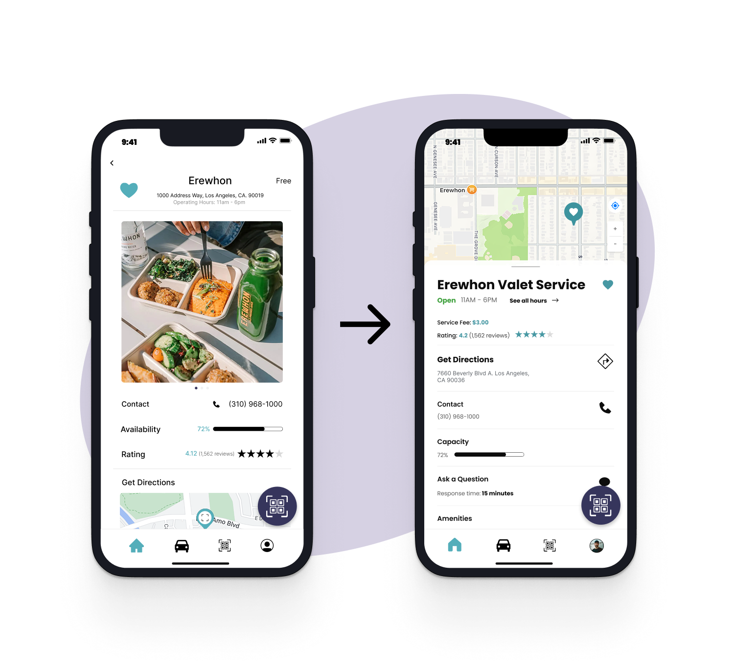
QUEUE APP

Digitalizing valet for businesses and consumers

PROJECT TITLE
Queue
ROLE(S)
UX Designer
TOOLS
Figma
Qualtrics
Illustrator
TIMELINE
3 months
PROJECT OVERVIEW
Queue is a capstone project for a User Experience Design Course at USC. As a team of four multidisciplinary designers, we sought to implement concepts and strategies learned in class to our project. The final deliverable for this course was a full-fledged hi-fidelity prototype that had gone through multiple rounds of user testing.

My primary role in this project was to be a visual designer, implementing my experience in graphic design and illustration to create a visually aesthetic product. I also had a major role in our white paper research, going through data
INTRODUCTION
What is Queue?
Queue is a B2B2C digital product for the drivers and consumers of a valet ecosystem. Driven by a QR code scanning system, it represents the potential growth of the speed, efficiency, and modernization of valet. Below is an example of our "Visual Value Proposition" we used to pitch our concept to our stakeholders.
visual value proposition: digitalizing contemporary valet for both consumers and business owners
CONTEXT
Why Queue?
In today’s fast-paced world, where convenience and efficiency are paramount, Queue addresses the growing demand for smarter, more efficient parking solutions by digitalizing the valet parking experience.
business man annoyed in a linehands holding phone and key cars in a line
PROBLEM
Addressing an outdated system.
Valet is an ages-old system that has transformed from being a "luxury service" to an essential one as urban areas begin to experience vehicular traffic and a fundamental lack of parking. Among many reasons, a few that we chose to highlight are:
clock time icon

1. valet is slow.

One lot, 2-3 workers, and a disgruntled line of customers.
clipboard icon

2. valet is paper.

From cash-only payments to current customer data, everything is on paper. This leads to an inefficient, wasteful, and time-consuming system.
lock reverse symbol icon

3. valet is insecure.

Vehicle safety, customer information, and even asset management for services that require licenses or keys are not guaranteed with traditional valet business models.
SOLUTION
Valet with Queue.
We envisioned Queue to be sophisticated enough to address all the listed challenges, yet simple enough to serve as a universal solution. Additionally, it would have to be optimized for both valet servicemen and their customers to use. With this, we created a preliminary problem-solution set:
list of problem solution sets
OVERVIEW
Project Timeline
To help add context to the scope of the project, visualized below is a rough timeline of our project and the steps we took to ensure a well-rounded product.
project timeline
CONCEPT DEVELOPMENT
Finalizing and refining the product concept with research
To accomplish this, we dove into a research sprint: analyzing both white paper and competitor data. During this time, we also sent out interviews to learn more about the general opinion of valet services. To tackle our research objectives, we split our priorities among three types of research: competitive analysis (market reserach), user interviews, and white paper research (academic sources).
list of product features

1. competitive analysis

  • took a further look into how attempts at digitalizing valet has affected businesses
  • researched different digital valet systems and their features
screenshot of user survey

2. user interviews

  • surveyed adults living in metropolitan areas about their experience and qualms with the current valet system
  • got feedback on app features and usability
stock image of research article

3. white paper research

  • researched different digital valet systems and their features
  • took a further look into how attempts at digitalizing valet has affected businesses
CONCEPT DEVELOPMENT
Result
  • Finalized feature list
  • Got to know our target audience better
  • Created goals and guidelines for branding
  • Understanding the market on paper
Through our group-focused UX research sprints, we successfully laid a strong foundation for the product by finalizing the feature list, gaining a clearer understanding of our target audience, and setting well-defined goals and guidelines for our brand identity. Additionally, we developed a solid on-paper grasp of the market landscape, equipping us with the insights needed to move forward with confidence and clarity.
VISUAL DESIGN
Shaping the Brand
During this stage, we plan and map out the app's core functions, with the final goal being the creation of a semi-functional prototype.

Step 1: Ideate

Back to the drawing board! As we prepared to start creating our mobile product, we began imagining and brainstorming how different types of users would interact with the product.
4-way split pictures of different ideation methods

Step 2: Wireframe

Equipped with our user flows and feature list, we began creating low-fidelity wireframes of what we imagined the product to look like. We repeated the process of designing and refining about 3 different times during the time allotted for this task.
screenshot of low fidelity wireframe

Step 3: Design System

Before jumping in to a high fidelity prototype, we finalized our visual design system (which was continuously updated during the process). This ensured we had a standard model while we completed our design.
screenshot of visual design system

Step 4: Prototype

Now that we had officially drawn out our branding guidelines, we began a formal prototyping process. Using Figma, we began to bring our product to life.
screenshot of highfidelity wireframe
USER TESTING + FEEDBACK
Bringing it back to the users
After finalizing the first version of the app, we sent out user surveys to garner insights regarding visual aesthetic, ease of accessibility, and the overall feel of the app. We also wanted to see what features were more likely to be used and which ones were not.
book icon

research purpose

Receive feedback for app concept, aesthetic, function, and feel
notebook icon

survey focus

1. Level of visual appeal;
2. Navigability and ease of access

demographic

Ages 20-42; Owns/ Actively drives a car; Lives in a metropolitan area
Research Takeaways
While a majority of users reported feeling somewhat (46%) to extremely (17%) comfortable using the app, 10 out of 34 respondents rated their comfort at 3 or below, highlighting areas where the user experience could be improved. Although no users reported feeling outright uncomfortable, this feedback indicates a need to refine onboarding, navigation, and interface clarity.

Our response to this feedback was to simplify the user flow, enhance in-app guidance, and follow common auto industry practices to ensure a smoother experience for all users. Additionally, with features like request for pickup, contactless payment, search destination, and digital ticketing emerging as the most popular, we chose prioritize these in our design iterations and ensure they are easy to locate and use.
CRITIQUES AND ADJUSTMENTS
Applying User Feedback
After receiving feedback, we strategized ways to apply it to our product. We ultimately came up with three main improvement pointers that we would use as the forefront of our refinement stage:

prioritizing critical information

  • condensed all critical information into one section, making it easier to find
  • standardizing UI to common map applications existent in the industry
  • alignment and grouping: reducing cognitive load

simplifying the user experience

  • reduce amount of words on the screen and replaced with graphic visuals
  • added more color, contrast, and vibrancy
  • create an environment of excitement and anticipation (adjusting the visual tone)

creating a hierarchy with different levels of information

  • researched differentchanged what information is displayed (price, address, vehicle information)
  • prioritize important information by size and placement
  • added visuals and a “request vehicle/vehicle requested” button to ensure better flow from the previous page digital valet systems and their features
FINAL PRODUCT
Queue: Streamlining Valet

1. skip the line

Request your vehicle in advance of your arrival and keep tabs on your spot in the queue

product highlight of queueing system
product highlight of car security measures

2. secure your car

Log all of your vehicle data in-app so car handoffs can be secure, efficient, and timely. Let your drivers know it’s really you!

3. pay it - your way

Pay in app in order to save time - or even as a backup in case you don’t have any cash.

product highlight of barcode scanning and review system
CONCLUSION
Final Remarks
As my first full-fledged UX project, I had an equal amount of trails and difficulties as I had fun working with my team. Some noted difficulties included coordinating with my team and making important design decisions separately. To be honest, there were a lot of clashes of opinion and miscommunications because we weren’t able to spend much time together due to our busy schedules. Though I have a lot of experience completing work in team settings, I quickly realized that it cannot be equally compared to a collaborative design setting. If I were to list my main takeaways from this project, it would be the following points:
  • First things first. Make sure you’ve finalized your product vision, mission, and target demographic before starting the design process and keep these at the forefront of your project at all times. On a side note, I found that preparing more helped me finish tasks faster than starting on the tasks first!
  • Less is more. As a novice UX designer, I mistakenly had the idea that a more fancy design would be more appealing to users. I was really set on having a “wow factor” and that our design should have “personality.” I should have been more empathetic towards non-tech savvy users (such as myself!!!)
  • Knowledge is gold. I personally decided to go the long way and do a little bit of academic research on valet services, and my perspective and knowledge of the market was definitely broadened and much more objective. (personal experience + empathetic thinking + academic knowledge = success!)
Thank you so much for following along with me and my team’s design journey and I really hoped you enjoyed reading through this project. You are here for the first of many stepping stones in my design career. If you have any questions regarding this project or any questions for me in general, I would love to answer them for you! Shoot me an email at rachelslessoryoo@gmail.com or a message on LinkedIn!